MOE PUPPY entered the Indian market with a multi-SKU grooming range built
around ingredient clarity and functional transparency.
The objective was to establish a clean commercial visual system — one that
could scale across variants, platforms and retail formats without losing structural
consistency
.
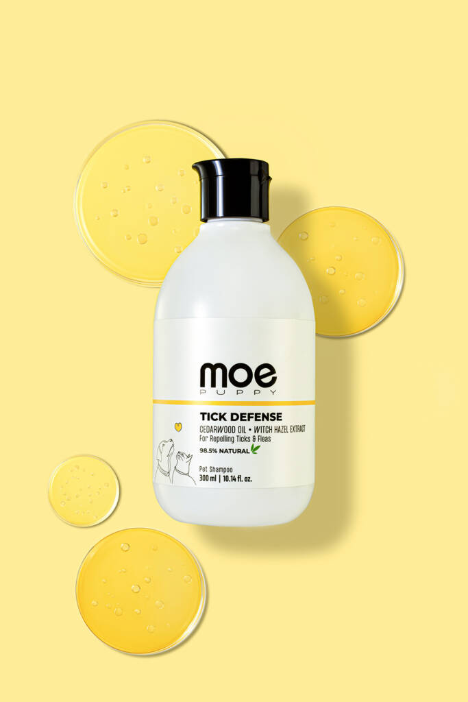
01 — The System
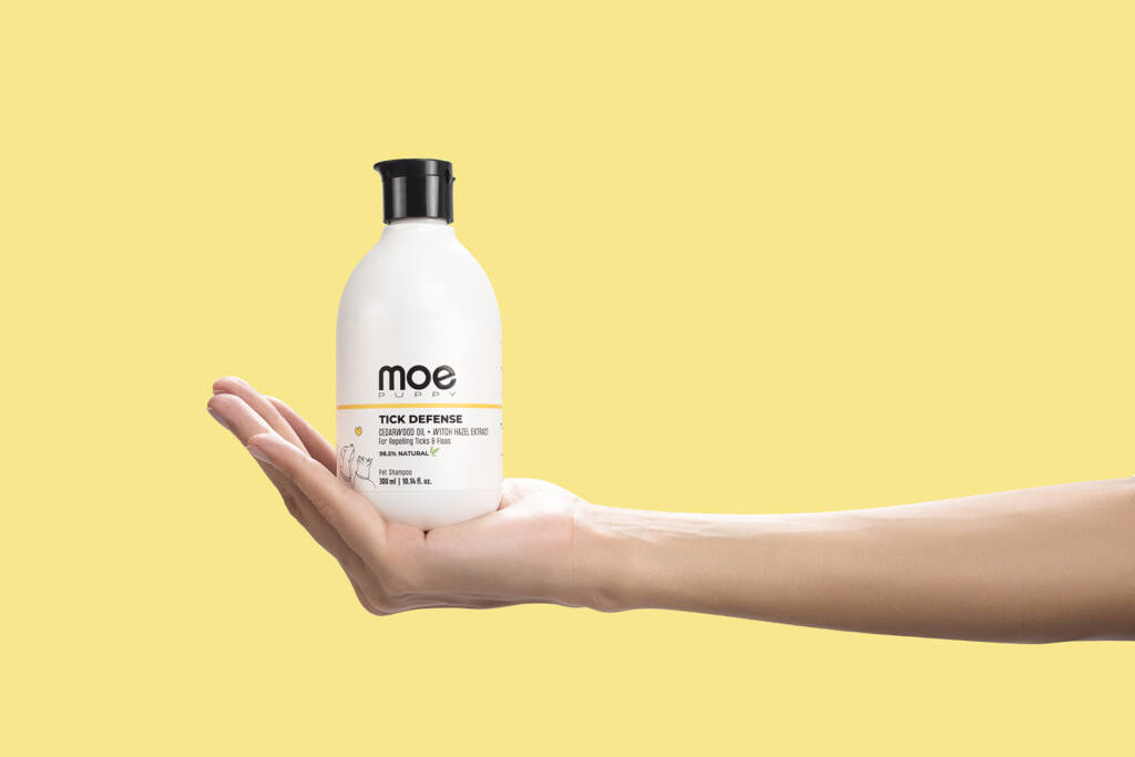
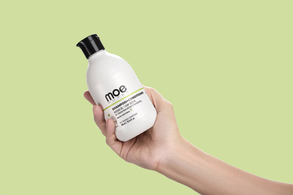
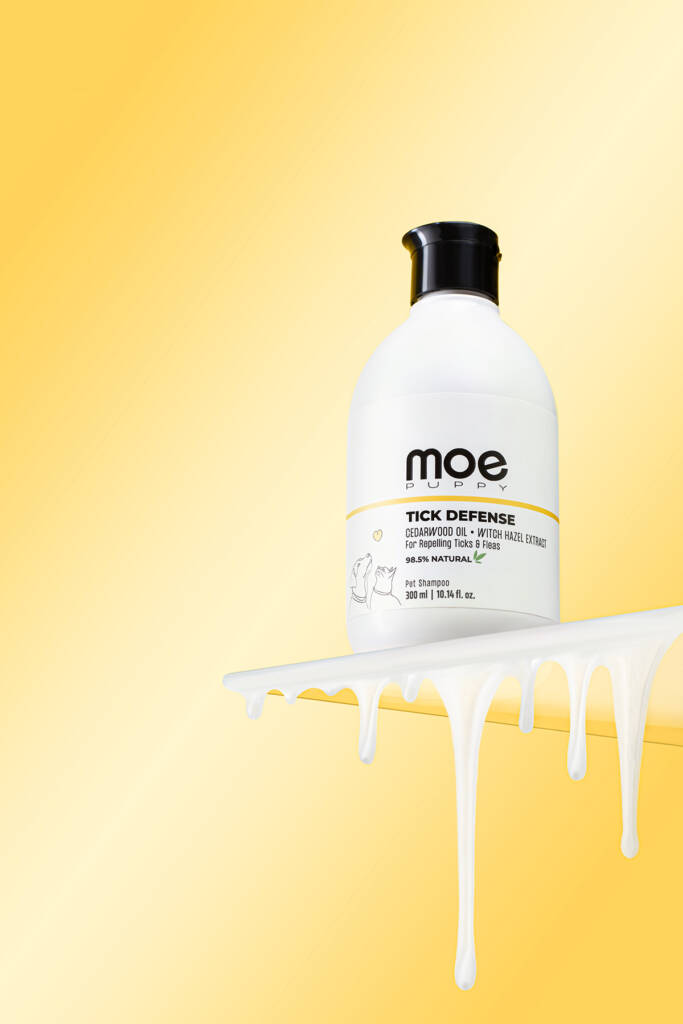
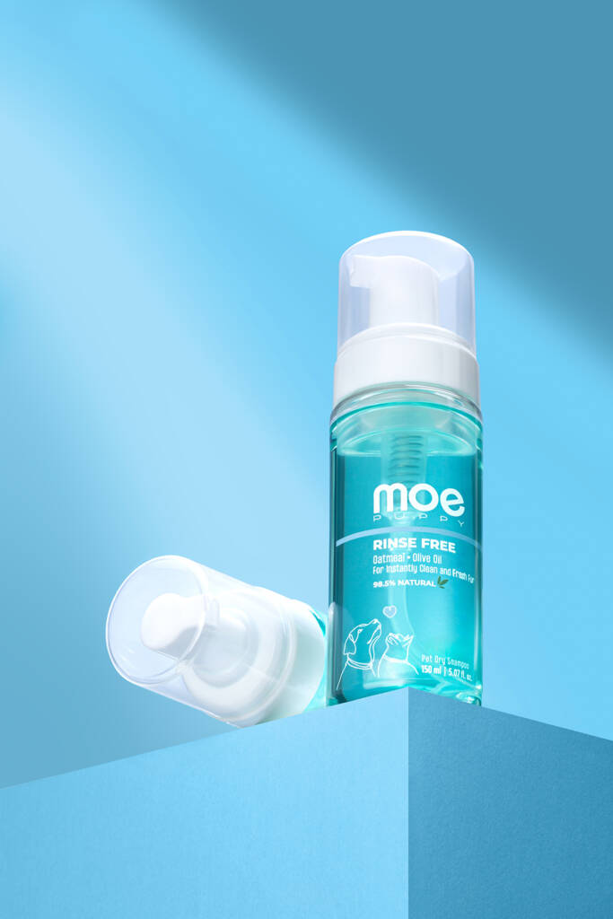
Each SKU was assigned a distinct color environment derived from its primary
ingredient profile.
Packaging hierarchy, lighting direction and framing logic were standardised to
create a unified brand grid across the range.
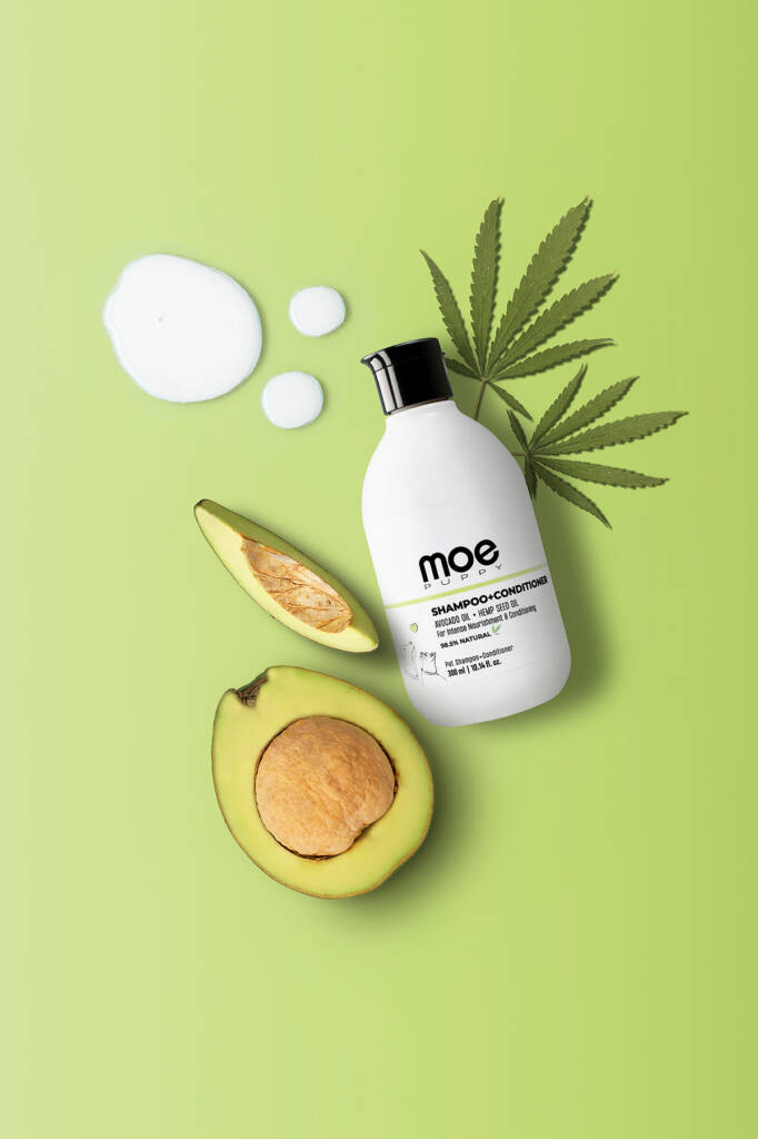
02 — Ingredient Visual Language
Ingredient references were translated into controlled compositions — not decorative elements, but
structured cues reinforcing product function.
Color separation, material contrast and spatial balance ensured clarity while maintaining commercial
discipline.
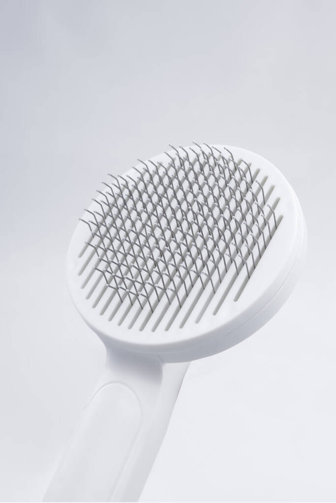
03 — Commercial Application
Interaction frames were developed for marketplace, e-commerce and digital-first communication.
Scale, hand presence and product handling were executed to demonstrate usability without shifting into lifestyle narrative.